
The UK fertility market is one of the most tightly regulated in the world. Our analysis of 107 HFEA-licensed clinics across the UK finds that clinic location map regional household income, more so than the likelihood of population need.
The UK fertility market is one of the most tightly regulated in the world. Our analysis of 107 HFEA-licensed clinics across the UK finds that clinic locations map regional household income more closely than the likelihood of population need.
The share of NHS-funded treatment in England has fallen from 35% to 27% between 2019 and 2023, meaning that the majority share of the private market is increasing. In London the privately-funded share reaches 80%. The patterns below examine how this provision is distributed across the UK’s twelve regions and nations.
Where are UK fertility clinics located?
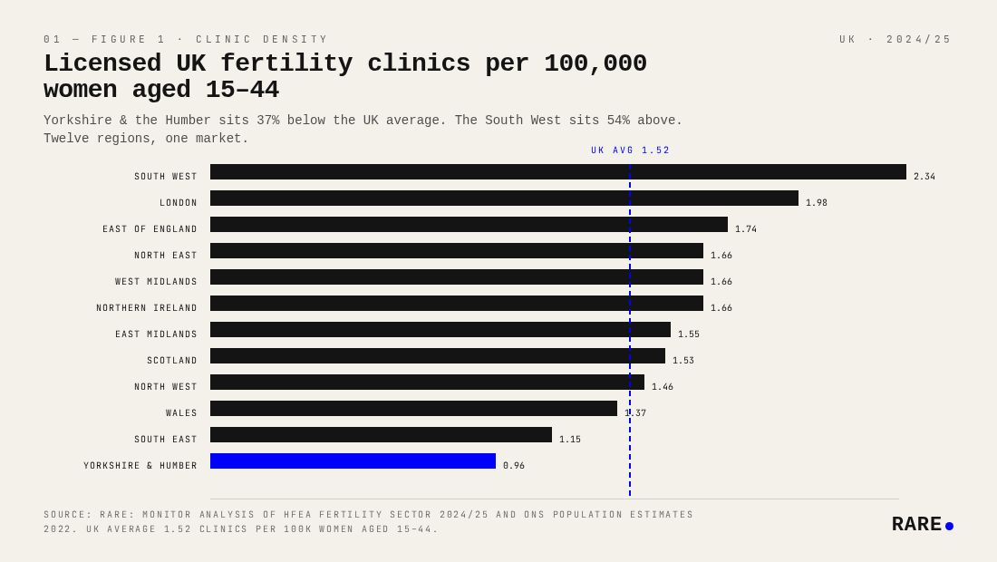
There were 107 HFEA-licensed treatment clinics in the UK in 2024/25, distributed across twelve regions and nations. The South West leads on density at 2.34 clinics per 100,000 women aged 15 to 44, well above the UK average of 1.52. London is second at 1.98. At the lower end, Yorkshire and the Humber is the clear outlier at 0.96, followed by the South East at 1.15 and Wales at 1.37.
The devolved nations sit close to the UK average despite lower overall income levels: Scotland at 1.53 and Northern Ireland at 1.66. That parity reflects the influence of more generous public commissioning. Wales (1.37) lags somewhat despite its national NHS framework. The South West's relatively high density warrants caution: clinic counts include providers whose geographic coverage extends across a large, low-population area. In practice, residents in this region likely face longer journeys to reach a clinic than the raw density figure suggests.
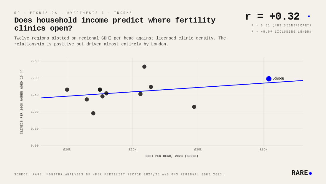
Does household income predict where fertility clinics open?
Across twelve UK regions, regional household income (GDHI per head, ONS 2023) correlates with clinic density at r = +0.32, but the relationship is not statistically significant (p = 0.31) and is substantially driven by London. Excluding London drops the correlation to r = +0.09, effectively zero. The income effect is largely a London artefact: the capital has by far the highest GDHI per head (£35,400) and the second-highest clinic density (1.98 per 100k), and its removal collapses the relationship across the other eleven regions.
There is no reliable evidence that income predicts clinic density as a general property of the UK regional market. The correlation exists only because of London.
Does fertility need predict where clinics open?
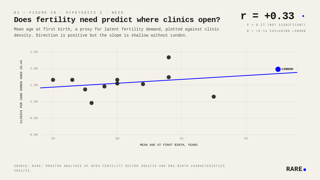
The need hypothesis says density should track demand. Mean age at first birth is the cleanest publicly available proxy for latent fertility need: families who delay birth are more likely to require clinical assistance to conceive.
Across the same twelve regions, mean age at first birth (ONS Birth Characteristics) correlates with clinic density at r = +0.33 (p = 0.27, not significant). When London is removed, the correlation falls to r = +0.14, weak but maintaining the positive direction. London is doing most of the work here, as in the income hypothesis, although the sign is at least consistent with the hypothesis across the remaining eleven regions.
The result is indicative rather than conclusive. Areas where families delay birth tend to have slightly more clinics, but the sample is too small and the non-London relationship too faint to draw firm conclusions.
Do private clinics open where NHS provision is weakest?
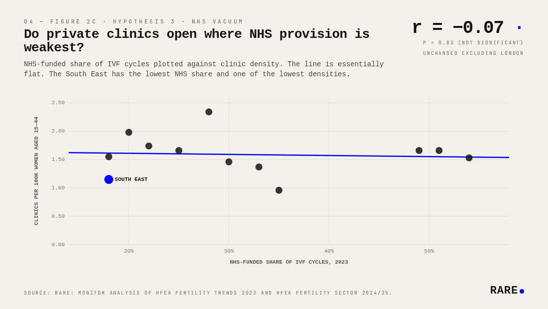
The most charitable hypothesis for private supply is that it fills public gaps: clinics open where the NHS does not.
They do not. The correlation between NHS-funded IVF share and clinic density is r = −0.07 (p = 0.83), statistically indistinguishable from zero and unchanged when London is removed. The private fertility market shows no tendency to locate where NHS provision is weakest.
The South East is the clearest illustration: it has the lowest NHS funding share in England (18%) yet also one of the lowest clinic densities (1.15 per 100k). If private markets were compensating for public underinvestment, the South East should have abundant private provision, however this seems not to be the case. Commercial location decisions are driven by market size and hub proximity, not by gaps in public funding.
Why do wealthier regions rely less on the NHS for IVF?
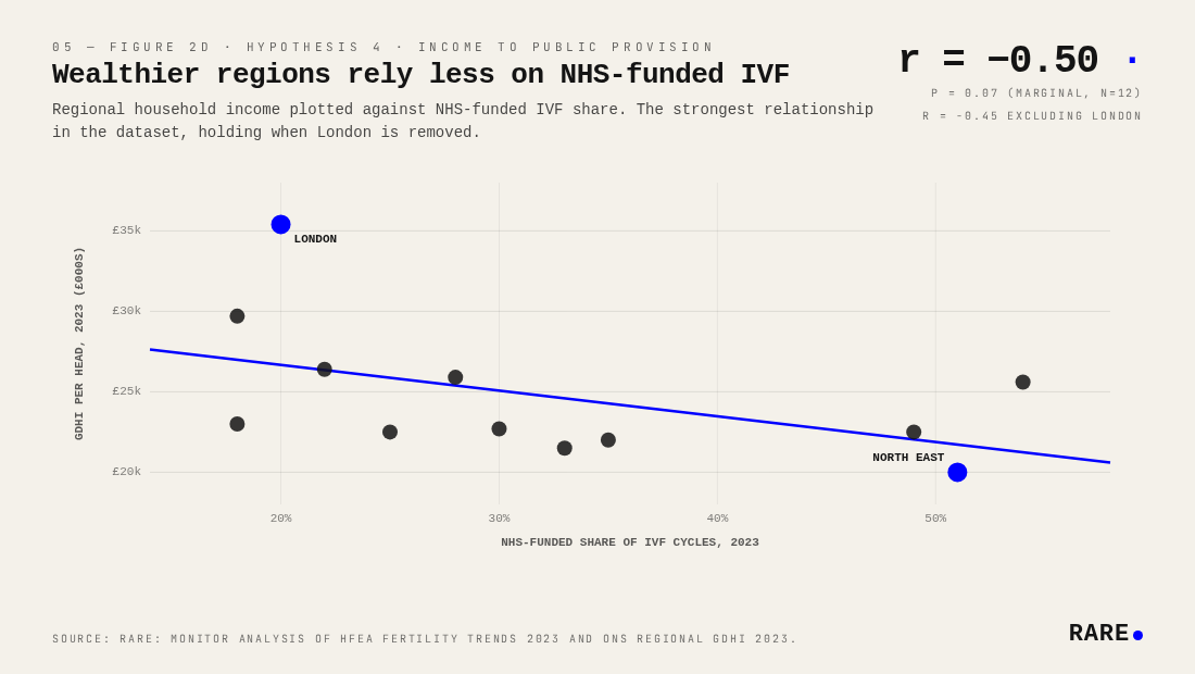
The strongest relationship in the dataset is the simplest. Regional household income predicts NHS-funded share of IVF cycles at r = −0.50 (p = 0.07, marginal at n = 12), and the relationship holds when London is removed (r = −0.45). London at £35,400 GDHI per head has just 20% of IVF cycles NHS-funded. The North East at £20,000 has 51%.
The mechanism is straightforward: wealthier patients self-fund, reducing local pressure on commissioners to provide cycles. Higher private demand sustains a parallel commercial market, which in turn lowers the political cost of restricting public provision. The relationship narrowly misses the conventional p < 0.05 threshold, largely because n = 12 gives very limited statistical power, but the directionality is clean and consistent across all twelve regions.
This matters because NHS provision is contracting nationally. NHS-funded share fell from 35% of all IVF cycles in 2019 to 27% in 2023. The regions most dependent on public funding are also the ones least able to absorb that contraction.
Where is the UK fertility access gap deepest?
Layering the four findings together produces a picture of compound disadvantage. The North East and Yorkshire and the Humber have lower regional incomes (£20,000 and £22,000 GDHI per head respectively), fewer private clinics, and historically high reliance on NHS funding that is now being cut from above.
The contrast with London is sharp. London has the highest income, the oldest mothers, the lowest NHS funding share, and a third of all UK fertility clinics. Remove it and every correlation in this analysis weakens substantially. London is not a useful model for understanding how the private fertility market serves the rest of the country.
Highest NHS-funded share of IVF cycles, 2023:
Scotland: 54%, down from 62% in 2019
North East: 51%, down from 55%
Northern Ireland: 49%, up from 34% (the only region where NHS share rose)
Yorkshire and the Humber: 35%, down from 39%
Wales: 33%, down from 39%
Lowest NHS-funded share of IVF cycles, 2023:
South East: 18%, down from 24%
East Midlands: 18%, down from 24%
London: 20%, down from 26%
East of England: 22%, down from 28%
West Midlands: 25%, down from 30%
A family in Yorkshire or the North East faces three things at once: restricted NHS access, few private alternatives, and lower household income with which to fund self-pay treatment. The fertility access gap is a structural problem in the English Midlands and North, and private markets have shown no inclination to address it.
The NICE clinical guideline recommending up to three full IVF cycles for eligible women remains the standard of care, but it is not mandatory. ICB-level commissioning variation has produced the patchwork visible in the data above. Patient advocacy bodies including Fertility Network UK and the British Fertility Society have flagged the IVF postcode lottery for years; this analysis quantifies its commercial consequences.
Where the NHS shrinks, private supply does not follow
The strongest signal in the data is that NHS-funded share of IVF correlates negatively with regional household income. Wealthier regions rely less on the NHS; poorer regions rely more. Scotland (54%), the North East (51%) and Northern Ireland (49%) have the highest NHS-funded shares; the South East (18%), East Midlands (18%) and London (20%) the lowest. National NHS-funded share has fallen from 35% in 2019 to 27% in 2023, with most regions tracking that decline.
Private clinic density shows no compensating pattern. The correlation between NHS-funded share and private clinic density is statistically indistinguishable from zero (r = −0.07). The North East has the highest NHS provision and the fewest private clinics; the South East has the lowest NHS share and one of the lowest densities. Whatever determines where private fertility clinics open, it is not the strength or weakness of local NHS provision.
Consolidation reinforces the pattern. 49 of the 71 private clinics in this analysis are owned by clinic groups, including CARE Fertility, IVI-RMA and TFP/Vitanova. Expansion decisions sit with investors weighing commercially attractive catchments. The patient experience that emerges from these structural patterns is uneven: families in regions like Yorkshire or the North East face a contracting NHS pathway, fewer private alternatives, and lower household income with which to fund self-pay treatment.
Methodology: Rare.Monitor analysis of HFEA Fertility Sector 2024/25 and Fertility Trends 2023, ONS Regional GDHI 2023, ONS Population Estimates 2022, and ONS Birth Characteristics 2021/22. Base: 107 licensed UK fertility treatment clinics distributed across twelve UK regions and nations. Regions not individually stated in HFEA reports were estimated from 2020 proportional distribution scaled to 2024/25 totals.